In France, things are finally opening up, including gyms, which reopened last week after 8 months of closure.
It seemed like a good time to start working out again so I did a search for local TRX classes.
My search led me to the page of a local gym. A browse of their site showed they do offer TRX and also many other classes, including cycling, Zumba, pilates, trampolining, and yoga. Satisfied with the choice, I moved on to the pricing page.
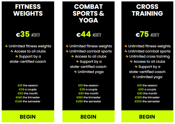
Instant confusion. Here is the pricing chart with the 3 options (with a rough translation below).


Have a quick glance at the plans and see if you can answer the following questions:
- Is there a commitment or can you just pay month to month?
- Do all the plans include TRX classes?
- Which plan would include boxing fusion?
I took my time to analyse the plans because I was motivated. I knew I specifically wanted TRX classes and was ready to buy a membership.
If I’d just landed on this site from a Facebook ad and wasn’t actively looking for this service I would have closed the page after a minute of confusion and gone back to scrolling my feed.
Analysis paralysis
Needless to say, I didn’t sign up. The pricing page was confusing and caused analysis paralysis.
Analysis paralysis is when you have to think too hard to make a choice because an offer is confusing, or overwhelming. Instead of pushing through it, it’s easier to just not make any decision.
It can occur when you have too many options or when there is too much information given. When there’s no easy way to scan and understand the different options and which one would be most appropriate or the best deal.
The gym pricing plan was deliberately misleading. It is not immediately apparent that the highlighted prices are based on an annual commitment.
This is not mentioned on the plan and is only figured out by looking at the prices in smaller print and finding another larger monthly price listed.
If you make your pricing page confusing and don’t make it clear why a plan is better than another, how much the user will pay and any other vital information, then people will leave. Especially if they are not already familiar with you or your product or motivated to buy.
We all have to make enough decisions every day and don’t want to have to puzzle out a pricing page, grab a calculator, or look through the other pages of the site trying to figure out what the categories even mean.
Making your pricing plan easy to understand
Now look at the pricing table for the Urban Sports Club membership. This is a membership which gives access to many various gyms and studios.
This one is easy to read. You can quickly understand the difference between the plans. Each additional advantage is added to the list and the number of venues accessible for each plan is prominent at the top.
I visited this page and signed up and loved all the classes I was able to take. It was easy for me to make a decision.
In addition to clearly presenting the options in an easy to understand way, they also guide potential customers to make a choice.
The medium plan has a blue button and an orange box to draw your attention to the free trial. They have the price listed at €0 and the full price is still easy to find but in grey text so as not to distract attention.
If we’re not sure, we can click on the blue button and have a risk-free trial. We don’t have to think about it too much because we have nothing to lose.
Netflix make it even easier
Netflix has established itself as a huge global brand with over 200 million subscribers worldwide. You likely already have an account (or share your dad’s or ex’s).
Netflix makes it easy to sign up.
In the pricing chart above, you quickly understand the differences in terms of number of connections and devices and availability of HD and Ultra HD.
There is plenty of white space and the table format makes it easy to scan. There is no ambiguity and the wording is simple. It is designed to avoid any analysis paralysis.
In less than 30 seconds you can identify the right plan, whether you’re looking for an account just for you to watch on your phone or one for your family to enjoy on the fancy new TV.
Takeaway for your pricing table
Humans don’t like to be confused or to have to try hard to understand something to make a choice.
Especially when that choice is going to cost us money.
If you want your potential customers to convert, you should:
- Help guide users to the best choice by using colours, size, or placement to attract attention
- If there are many features and benefits, choose the most important ones to avoid overwhelm
- Keep the language simple and make sure the relevant information or explanations are all available on the page
- Keep the formatting clean so it can be read easily while scanning
- Offer a free trial or a guarantee to make the offer risk-free